Shipped
B2B SaaS
Design System
Rebranding
My Role
Product Design Lead
Timeline
May 2025 - Aug 2025
Team
1 Design Engineer
1 Project Manager
6 Engineers
Skills
UX/UI Design
Visual Design
Product Strategy
Impact
Contributions
DNV Healthcare


Healthcare Organizations


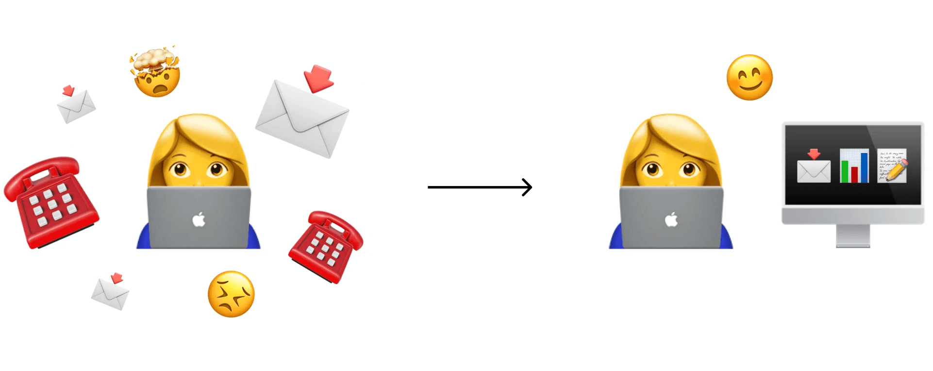
The problem
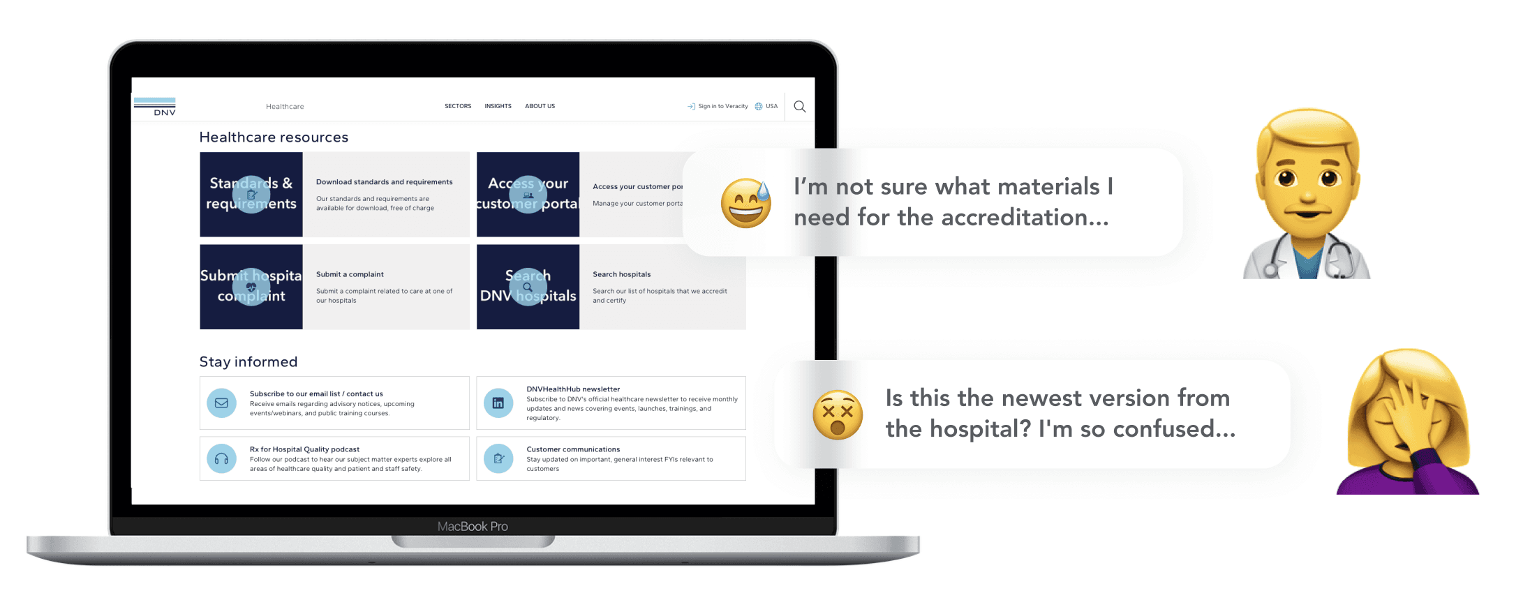
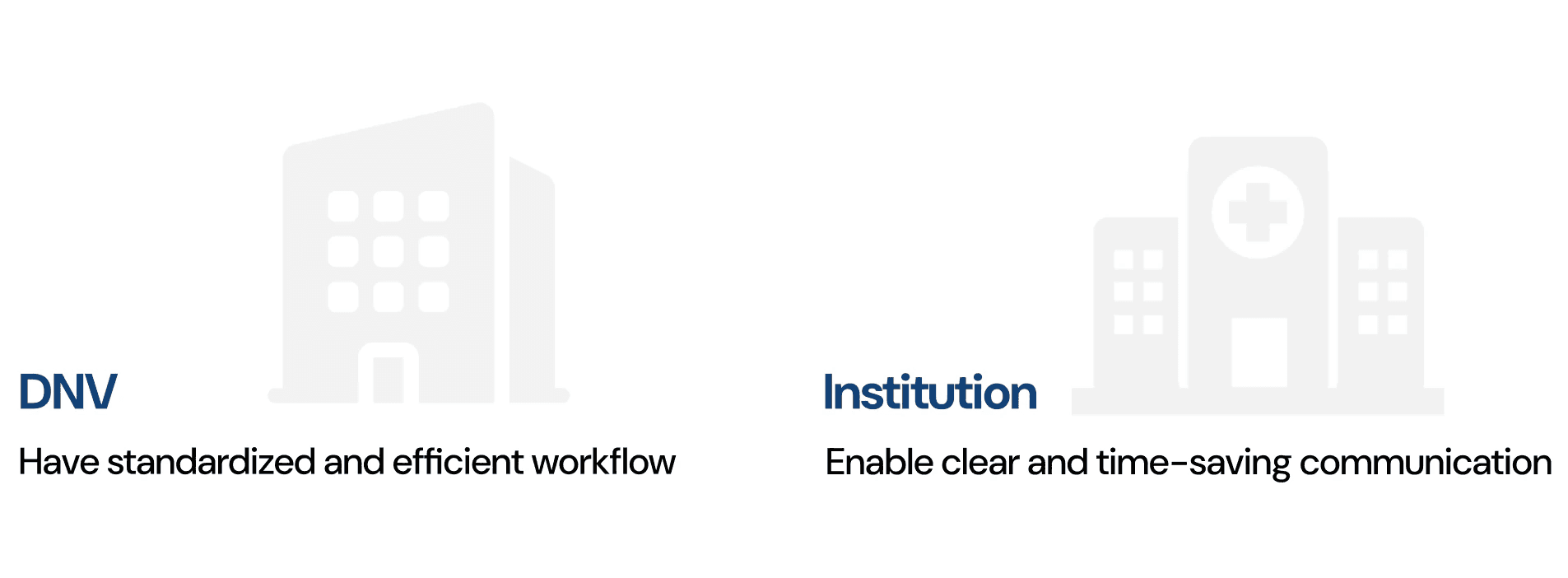
The goals
Outcomes
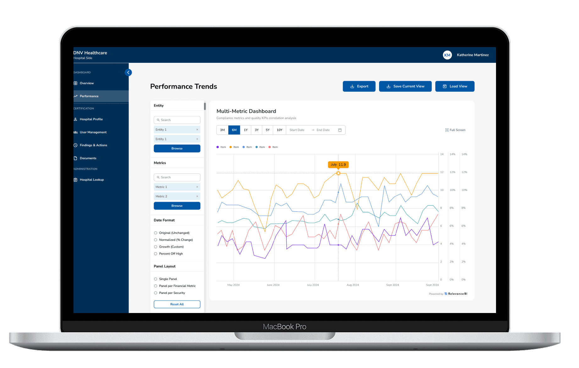
Visualize your data to enhance quality, reduce risks, and drive better outcomes.

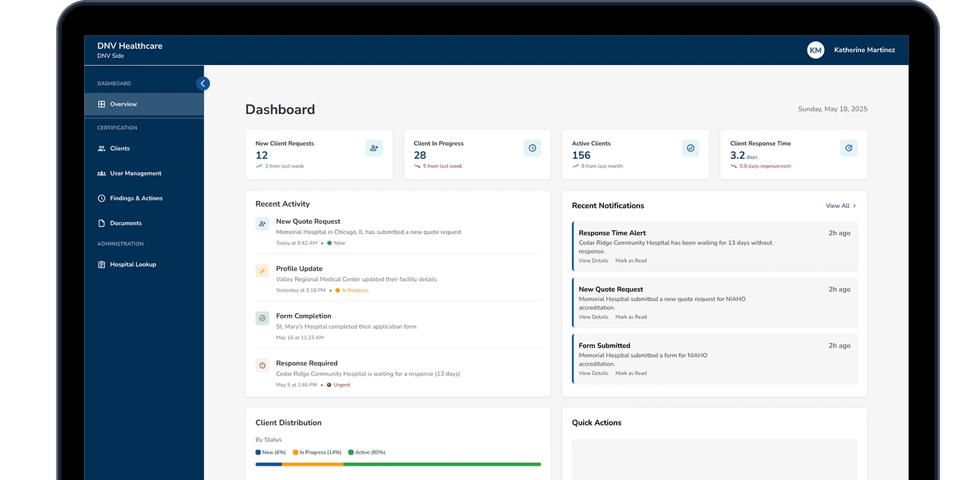
In our closed loop and scalable architecture, we can handle everything from initial outreach to existing client management.

Results
Challenge 1
When I first joined the company, they only had a design guideline written in a doc
Solution 1
I built and maintained the design system, which serves 300+ screens to make a cohesive visual.

Challenge 2
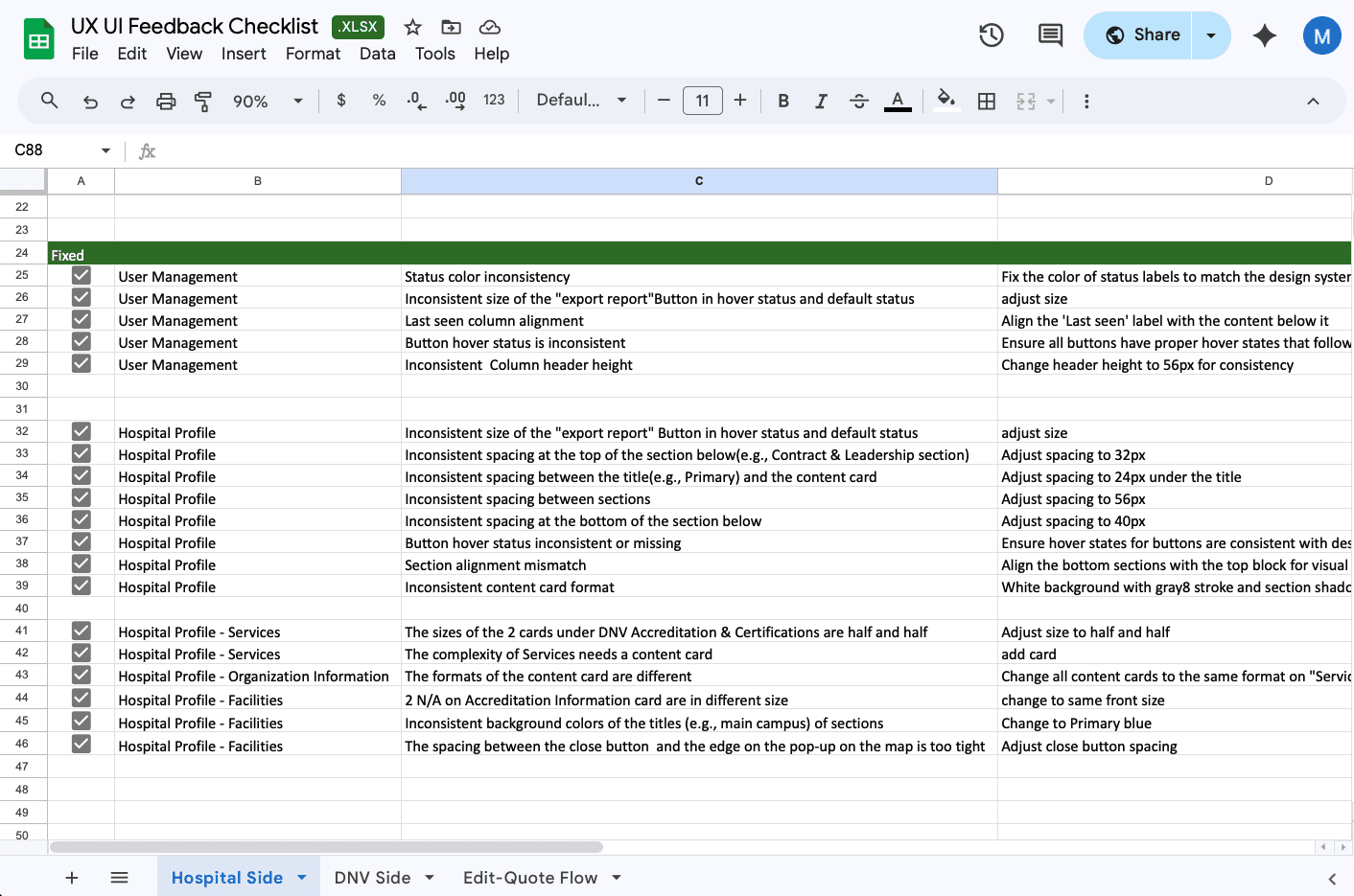
At first, since there was no QA team, the design quality wasn’t consistent.
Solution 2
I took the initiative to review the outcomes and created a fix checklist for developers.
Challenge 3
There were times when the PM and I weren’t clear on which direction was better
Solution 3
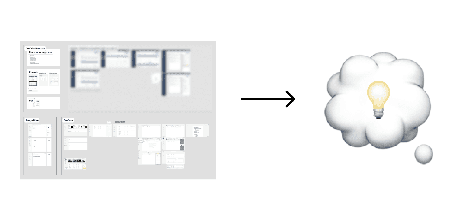
I conducted competitive research, then discussed it with the PM to figure out the best decision.
Iteration 1
Before

❌ Recent Documents took over the page
Recent Documents drew the most attention but wasn't the main task.
❌ Two navigation paths made confusion
With tabs on top and a sidebar, users had to guess where a file lived.
After

✅ Scaled down Recent Documents
Recent Documents became a compact list that shows clear details without crowding the page.
✅ Consolidated 2 nav bars into 1
With tabs on top and a sidebar, users had to guess where a file lived.
Iteration 2
Before

❌ Finding cards tried to do everything
File preview, upload, and assign all appeared at once.
❌ File details buried what needed attention
Users read through them just to find urgent findings.
After

✅ Finding cards became a triage view
Just the finding, its status, and the due date.
✅ Upload moved into the detail view
View the notification with less distraction.
Iteration 3
Before

❌ The page opened straight into a list
Users read through items just to count what needed attention.
❌ Regulation updates lived elsewhere
Users left the page to find out what triggered a change.
After

✅ A summary now leads the page
Three numbers show compliance status at a glance.
✅ Regulation updates now sit beside the list
New updates are visible without leaving the page
✅ The list moved below the summary
The page now reads from overview to detail.
Impact

Retrospective