Led the website redesign for a data consultancy as design lead, conducting usability testing to create a more informative, understandable, and cohesive showcase page.
My Role in Team of 3
Product
Client
Duration
Contributions
As the Design Lead, I organized research, improved layouts, and synthesized participant feedback into design recommendations.
Set up the the user test tasks
Designed a clearer showcase page
Client & Product
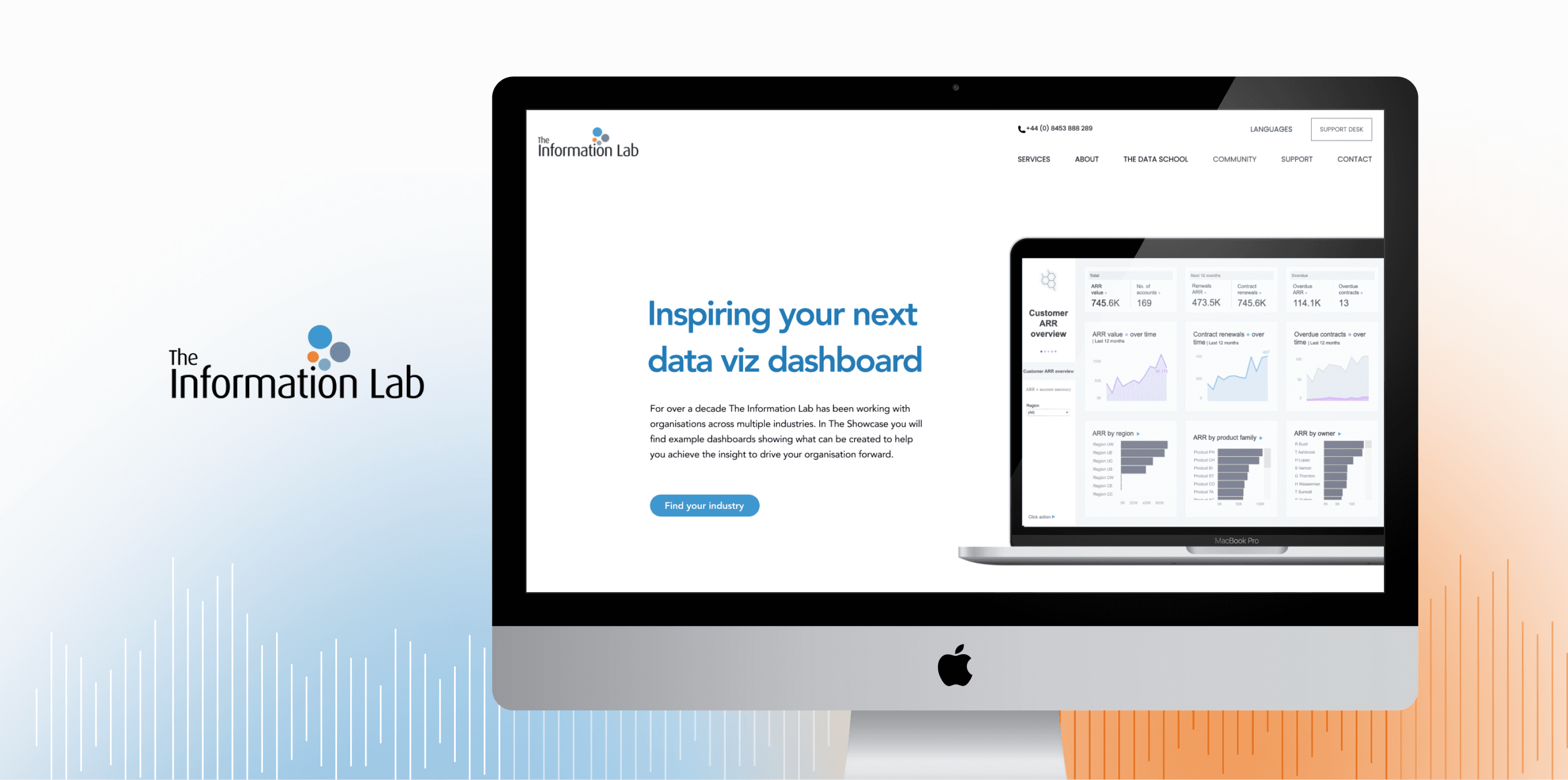
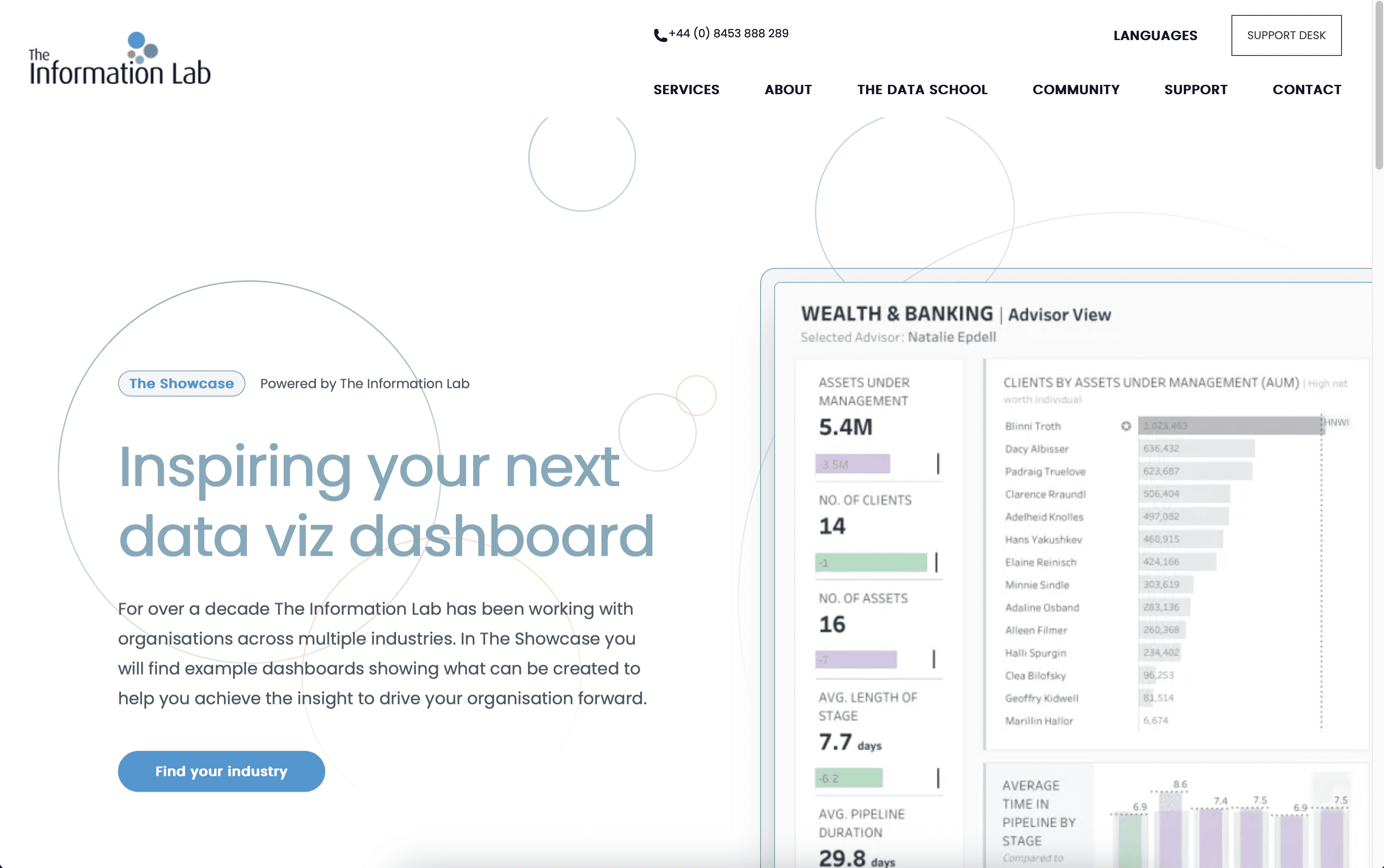
Redesigned The Information Lab's showcase page.
The Information Lab empowers organizations to make data-driven decisions by delivering tailored dashboard solutions and data strategies. The Showcase page serves as a portfolio of past case studies, intended to demonstrate the firm’s capabilities across various industries and help potential clients understand how similar solutions could meet their own needs.
The Information Lab is Europe’s largest data visualization consultancy. Their Showcase page is meant to highlight successful case studies across industries to attract potential clients, but the browsing experience was not engaging, and the case example page is under-informative.
There are so many cases, I don't know which one to look at.
I don't know what the case is worth and how they can help me.
Our goal was to improve the Showcase page’s usability so potential clients could easily find relevant case studies and understand the business value of each dashboard.
Research Plan
To identify usability issues on the showcase page and the opportunity areas for improvement.
Kick-off Meeting to understand project scope
We met with the client to define project scope as well as understand their goals and expectations. After the meeting, we knew that they wanted more engagement from potential customers and better clarity on dashboard case studies.

Screening Questionnaire to find qualified participants
We recruited participants who met the following criteria:
● Experience: Having experience in a data-related field
● Work status: Full-time, Part-time
● Countries: Any
Also, we recruited 2 sales team members from The Information Lab because they are responsible for sending case studies to potential customers.
Pilot test to refine tasks in the user test
We conducted 3 pilot tests before the formal user tests, so that we could evaluate the initial scripts, tasks, and follow-up questions. From the pilot test with the original 3 tasks, we found that some tasks overlapped with each other, so we decided to refine the tasks into 2 tasks as well as consolidate the follow-up questions.
Pre-test survey to know the basic information of participants
We gathered the information on participants' industries, experience with dashboard or data analysis, and where they are located before the user test, so that we could organize the demography of participants in the briefing.
Participants
Company location
United States
5
1
1
Asia
United States, Europe, Asia
Frequency of interacting with dashboards or reports
Daily
Weekly
Monthly
Rarely
2
2
2
1
User test to identify usability issues through 2 common tasks
We chose moderated remote user testing for both reach and cost-efficiency.
● Session Length: ~45 minutes per participant
● Device Used: Desktop
● Interface Tested: The Showcase page on The Information Lab’s website
We set up scenarios and tasks to evaluate whether the browsing process on the showcase page is intuitive to navigate, and whether the information on the case example page is sufficient for users to understand the value of the case and how to interact with the dashboard.
Scenario
You’re exploring different data consultancy firms to help your company improve internal reporting and data dashboard solutions. You’ve landed on The Information Lab’s Showcase page and want to understand whether their past work aligns with your industry’s needs and expectations.
Task
Task 1: Find a Case Relevant to Your Industry
Task 2: Imagining a Team Pitch


Post-test survey to evaluate participants' confidence & satisfaction
I created the post-test survey using the System Usability Scale (SUS) framework to quantify how users perceived the Showcase page’s usability.
Consolidated the research findings and brainstormed recommendations
I worked with my team to consolidate testing insights and identify the 3 most critical usability issues. I developed design recommendations not only based on user flow improvements, but also through competitor analysis. In addition, I referenced WCAG guidelines to provide visual accessibility suggestions that enhanced overall usability.

Presentation with The Information Lab to get feedback
Delivered our usability findings and design recommendations in a final presentation with The Information Lab, followed by a Q&A session to learn how the recommendations could help.
Overall Findings
Participants found the showcase page easy to navigate, but still experienced confusion due to the lack of contextual information.
65%
of participants indicated that the tasks was easy to complete.
“It was pretty straightforward.” — Participant 1
58%
of participants found the site easy to navigate, attributing this to its visually appealing interface.
3.45/5
Overall usability
2.93/5
Task-related usability
85%
of participants experienced confusion during tasks completion due to the lack of specific content or contextual information
These findings underscore a usability gap between visual design and content clarity, suggesting the need for improved informational support within the Showcase page.
Findings & Recommendations
Top 3 Issues: Vague Categorization, Inefficient Layout, Lack of Context
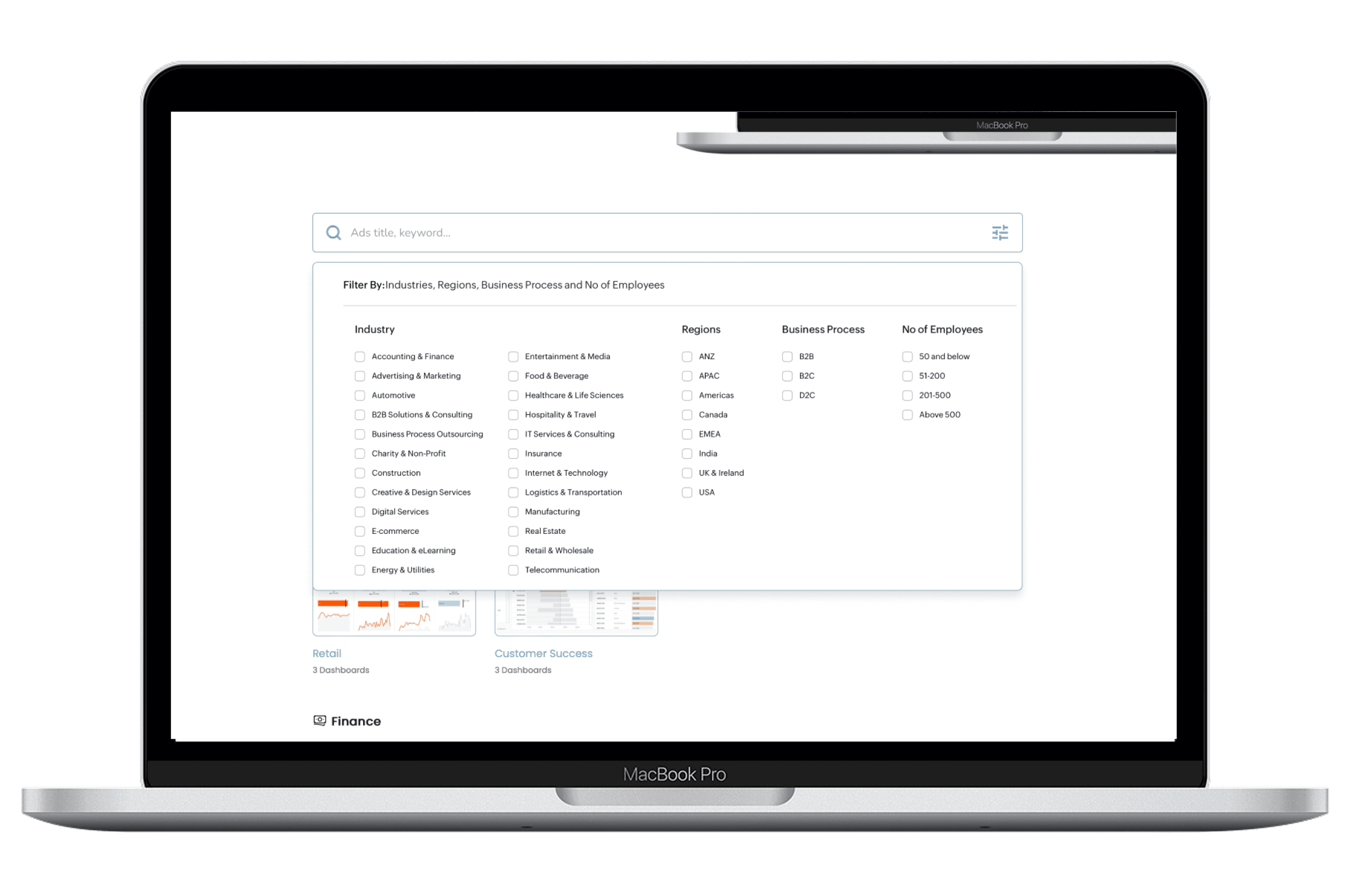
Findings 1: Vague Categorization on Showcase Page
Participants frequently searched for specific industries but found that the available categories did not align with their departmental or business needs.

“It is overly generic titles, kind of lead me to speculative browsing.”
The categories didn't align with departmental or business needs.
Recommendation 1: Introduce search filters to enhance the "find your industry" functionality on the Showcase page.
To improve content discoverability and help users efficiently locate dashboards relevant to their field, I recommend implementing a search filter system. Currently, users face difficulty navigating broad and often ambiguous category labels like “Commercial” or “Finance,” which don’t always align with how they define their own roles or sectors. This results in speculative browsing.
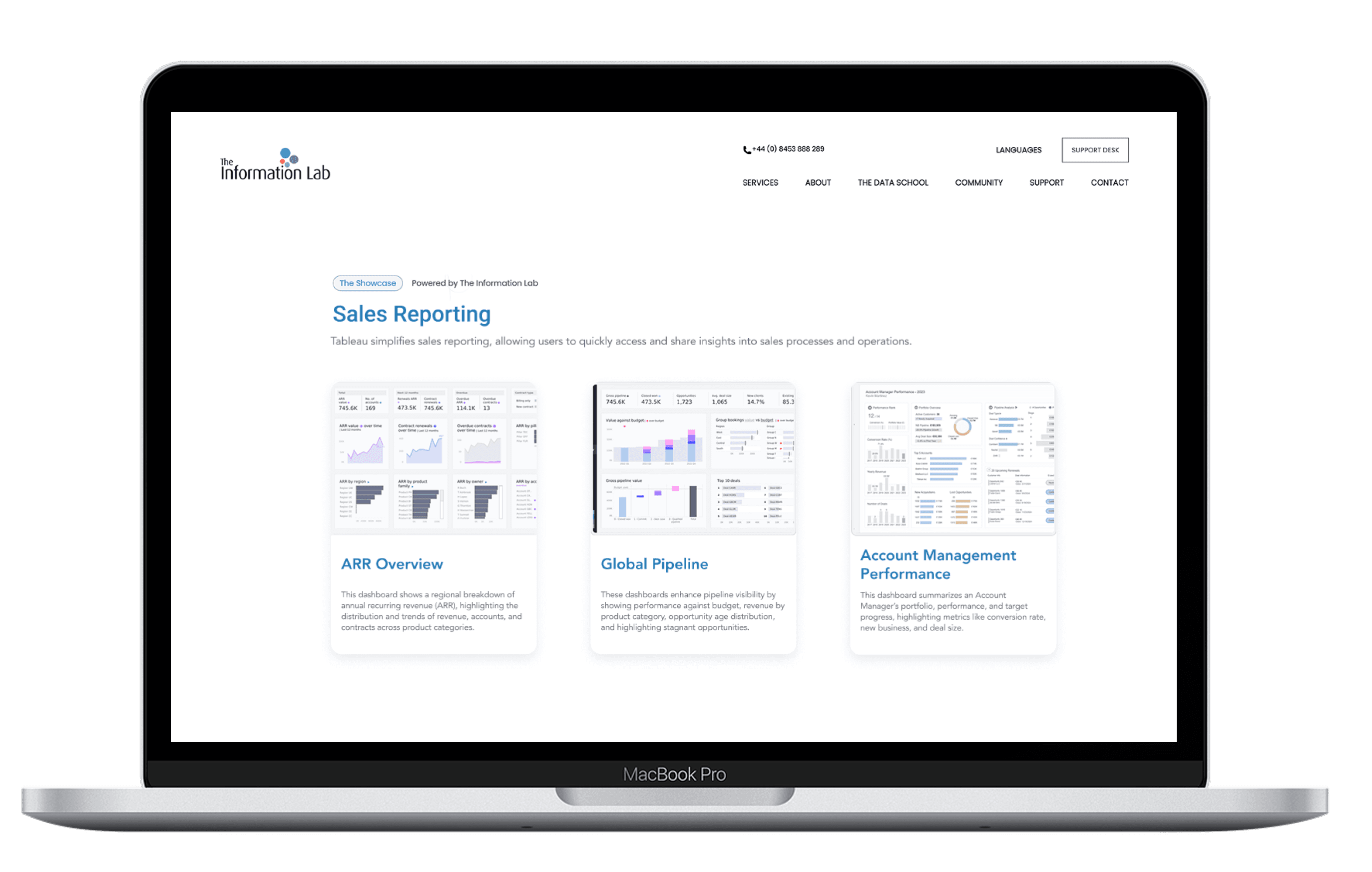
Findings 2: Inefficient Layout on Topic Page
The topic page makes it difficult for participants to scan content quickly and view multiple cases at once.
“I don’t like they’re split up [between] higher vertical scroll.”
Participants would like to see contents on the same page as it increases the scrolling.
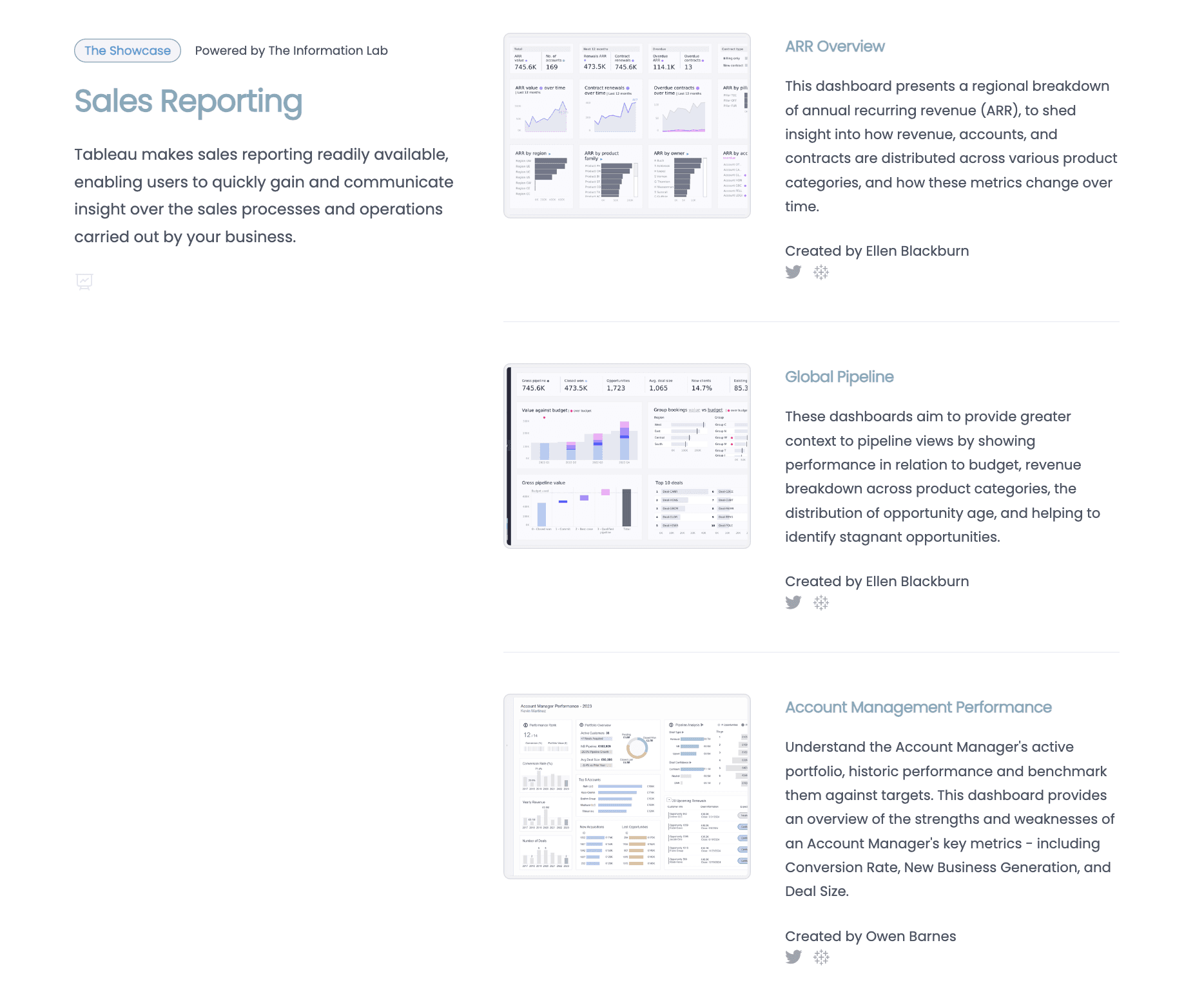
Recommendation 2: Introduce a new layout to display the cases in the topic page.
To enhance usability and visual appeal, the topic page should adopt a new grid-based layout for displaying cases, such as "ARR Overview" and “Account Management Performance.” Each case can be presented in a uniform card format featuring a consistent image thumbnail, a short title, and a brief description.
Findings 3: Lack of Context on Case Example Page
Participants had a hard time understanding the values of the case and how to interact with the dashboards due to lack of information and unclear instruction.
"It's not giving me enough context to understand what it's talking about."
It was hard for some participants to understand the data displayed on the dashboard.
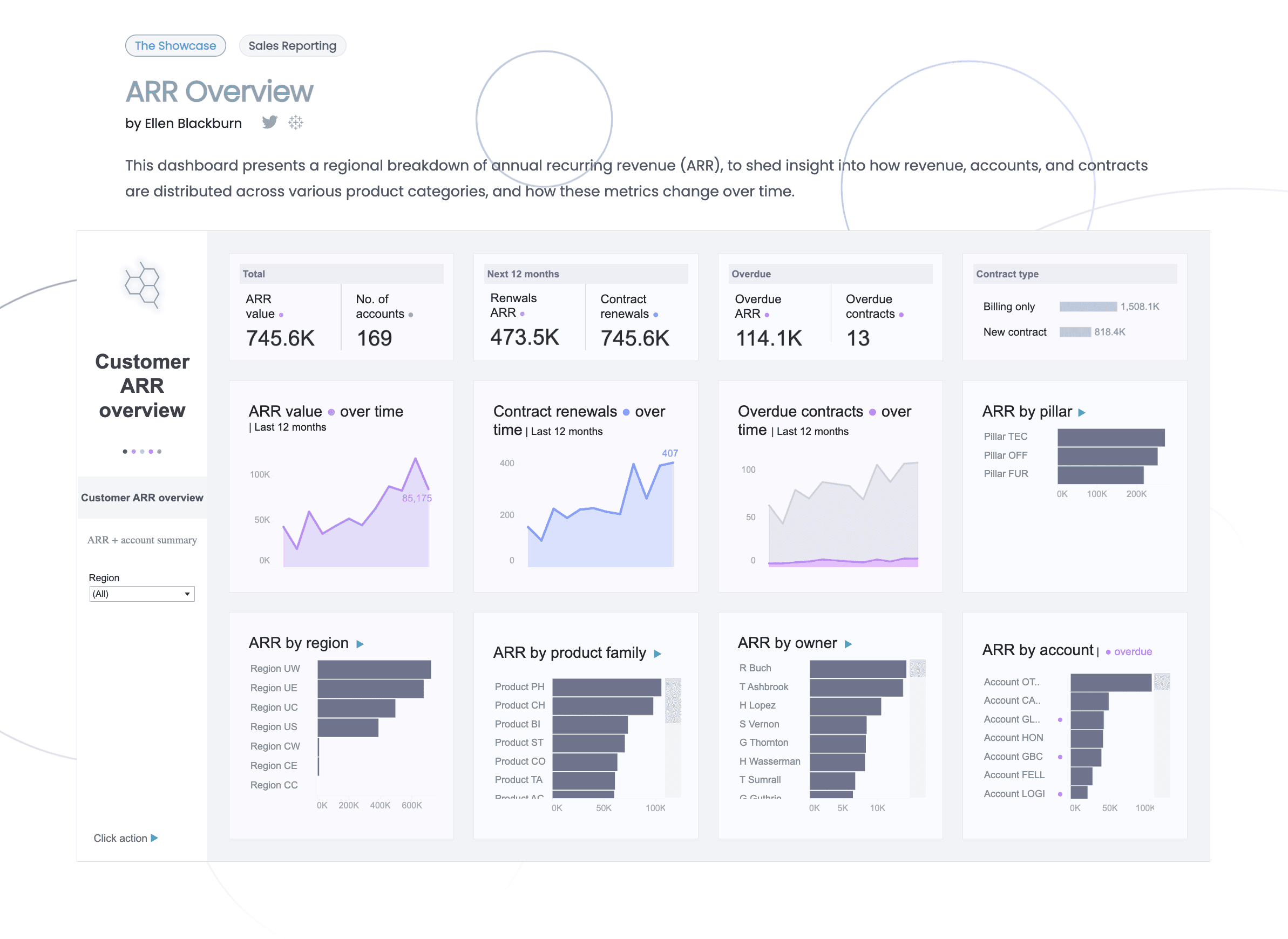
Recommendation 3: Add a short summary of the data displayed so that users don’t skip important information.
To ensure users don’t overlook the value of each case, I recommended adding a brief overview that highlights the important takeaways from the case. By presenting this context up front, users can quickly grasp the significance of the dashboard content and are more likely to engage meaningfully with the visualized data.

Using the Showcase page on The Information Lab’s website, users can easily navigate through example cases and evaluate whether such tools align with their own business needs. However, several usability issues were identified through the user tests we conducted, including the top 3 Issues: vague categorization, inefficient layout, and lack of context. I improved the usability by adding a search bar, adjusting the layout, and putting more context information.
The client appreciated the clarity and structure of our recommendations, especially the proposed search filters and the content summary approach. She found the recommendations directly aligned with their business goals and requested copies of our redesigned mockups for potential integration.

Adjust color contrast
Increase visual attraction
Tailored user test for customers and sales
Maximum gain with minimal change

