


Eye-Tracking Usability Test
UX/UI
My Role
UX Researcher
Project Manager
UI Designer
Team
Matt: UX Researcher
Anvita: Facilitator
Uraiba: UI Designer
Deliverables
Usability Findings
Recommendations
Design Mockup
Timeline
2025.08 - 2025.12
Contributions
Ran usability & eye-tracking 👀
Planned and facilitated tests to capture real user behavior and uncover friction points.
Synthesized research findings 🧩
Consolidated heatmaps, task data, and qualitative insights into clear problem themes.
Managed the project 📈
Coordinated meetings, planned the project timeline, and ensured we are on the right track.
Built design recommendations 🎨
Shaped solutions that aligned with user mental models and GT’s product goals.
Highlights
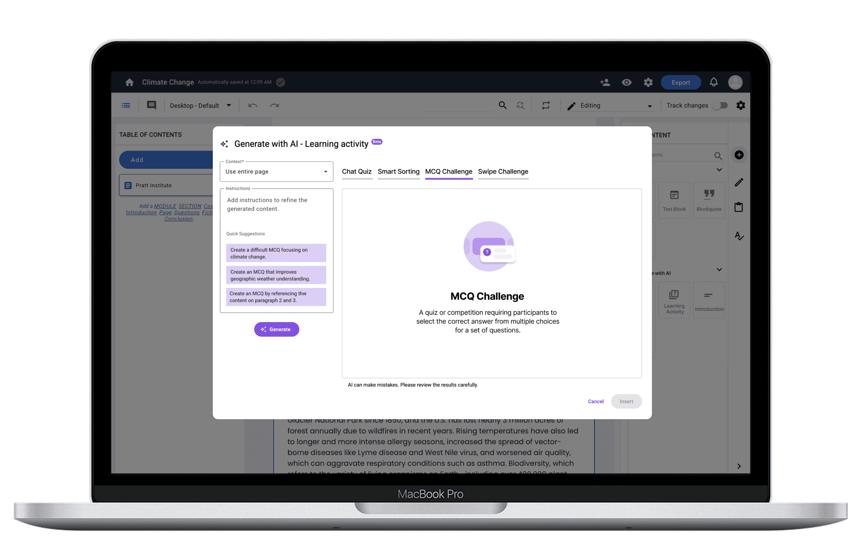
Redesigned Generate with AI Modal
Context
Gutenberg Technologies offers a suite of AI-enabled content creation tools designed to support editors in generating learning activities, drafting assessments, and improving written material. Despite the potential value, GT suspected that these AI capabilities were not being used to their full extent. Early feedback suggested that users were unsure where AI lived within the interface, what certain options meant, and whether the system’s behavior, particularly saving and versioning, worked the way they expected.
The Problem
While GT's AI tools offered powerful capabilities, they were largely perceived by participants as "hidden, confusing, and hard to trust". This friction stifled adoption and added unnecessary cognitive load to the content creation process. This project challenged us to look not just at usability, but at how language, workflow structure, and mental models influence users’ willingness to adopt AI-driven tools.
Goals
Research Overview
Our team was brought in to investigate these concerns through an eye-tracking usability evaluation. The project centered on two core questions:
Can first-time users efficiently locate, understand, and apply the AI tools?
What barriers prevent users from trusting or completing AI-assisted workflows?
Test Setup
Eye-Tracking Usability Testing
Background of 8 Participant
● Work types: Educator, Graduate Assistant, Editor, Author
● Experience with AI: 0 experience - Some experience
● Countries: United States
Tasks
To identify usability and learnability of the AI features for the CMS, we designed the following three tasks:
Task 1
Edit content using AI and compare versions
Task 2
Generate and edit assessment questions
Task 3
Generate a learning activity with AI
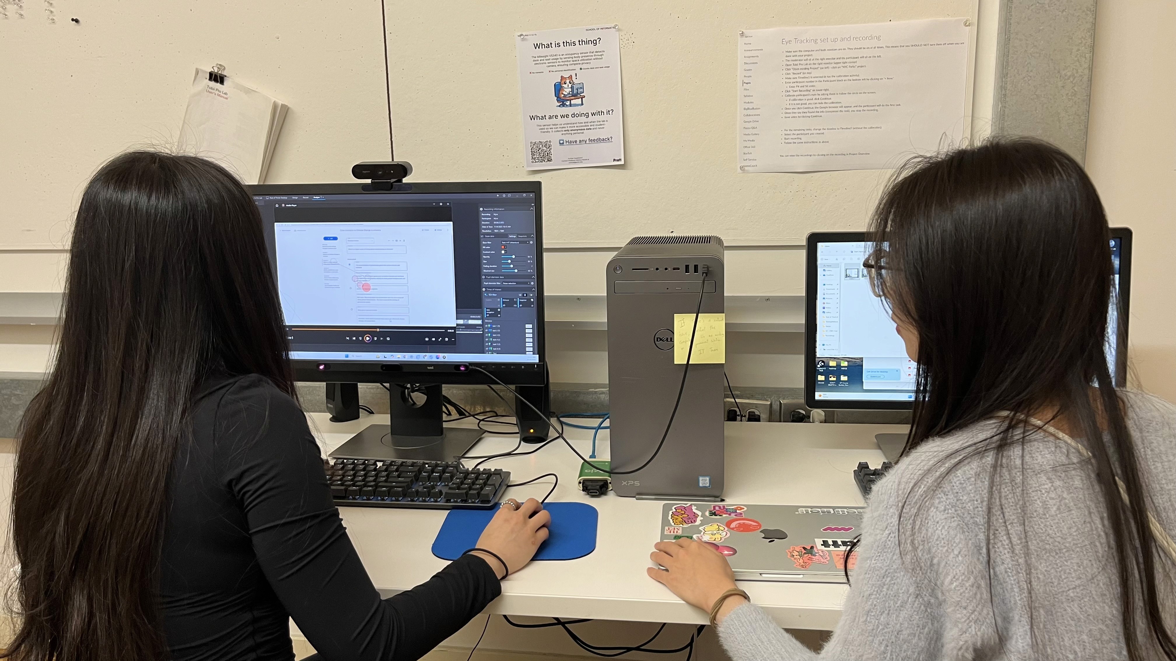
I conducted eye-tracking usability test in the lab
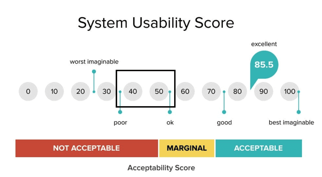
System Usability Scale (SUS)
The system usability scale (SUS) is a 10-question survey that provides a quick and reliable measure of a product's perceived usability with scores ranging from 1-100.
Retrospective Think-Aloud (RTA)
Immediately after each task, participants reviewed their session with us. This method helped us capture the emotional context behind each hesitation, misclick, or moment of confusion.
Data Sources & Tools
Data
Heatmaps showing misplaced attention
Time-to-locate metrics
Retrospective-think-aloud recording
Usability survey metrics
Quotes and observed Behavior
Tools
Tobii
Google Form
Google Analytics
Google Excel
Key Challenge & How We Fixed It
When everything seemed smooth, we faced a huge setback.
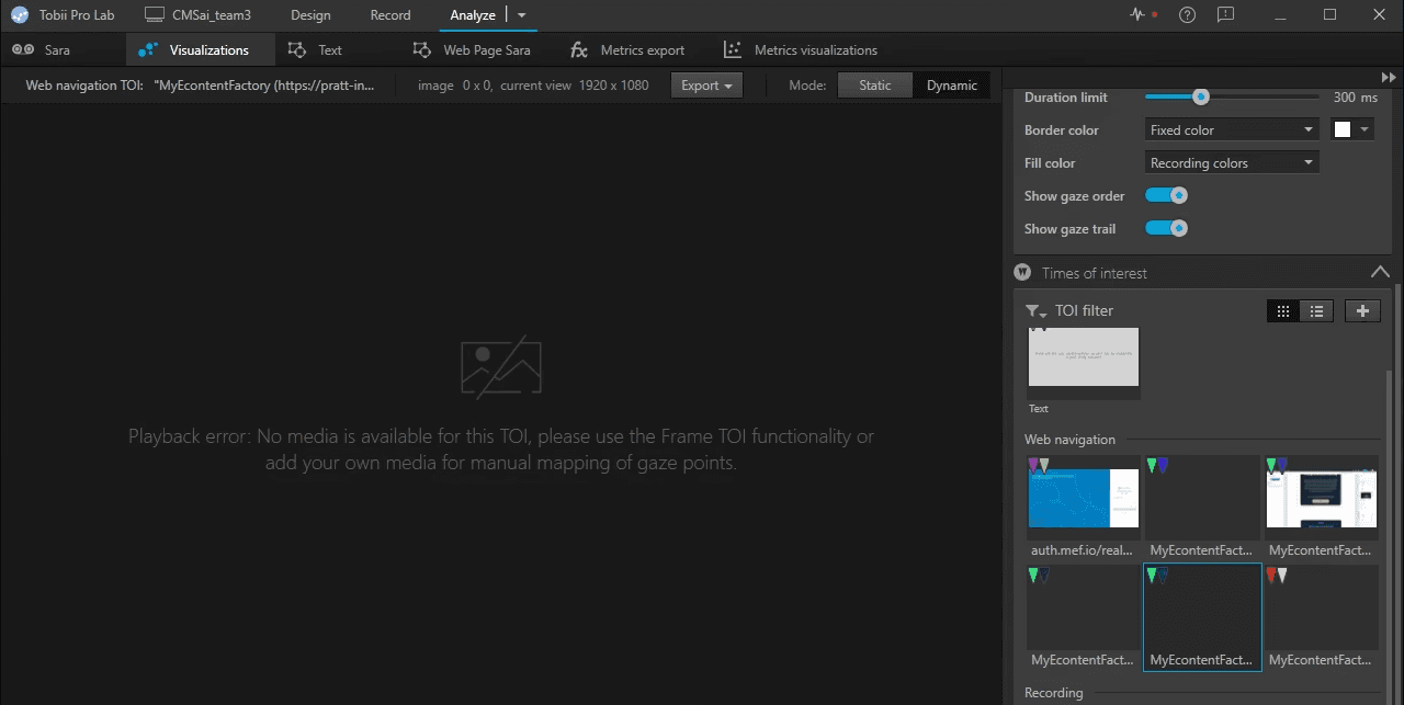
Screenshot from eye-tracking platform showing no media is available for data visualization
A primary challenge for this study was the lack of existing systemic data. Our research focused on new AI features, which primarily operated within modals. However, it was hard to track related activities on Google Analytics and Tobii (eye-tracking platform), which provided virtually no usable quantitative metrics to triangulate our findings. To compensate for this data constraint and ensure evidence triangulation, we strategically incorporated rich qualitative data alongside our visual insights:
Completion Time: To objectively measure efficiency and friction.
User Quotes (Verbatims): To capture the user's mental model and articulate their frustrations.
Heatmaps and Gaze Replay: To visualize the users' visual attention and navigation paths.
Overall Findings
Overall SUS Score
This labels the interface as somewhere between poor and okay.
Findings & Recommendations
Discoverability Issues: Low Discoverability Across AI Editing & Generating Tools
Finding 1
While every participant was able to find the AI-related features, it took a long time, indicating low discoverability.
Participants struggled to distinguish between multiple “edit” entry points and often clicked the wrong touchpoints entirely. Many assumed the “Add” button controlled all forms of content creation, including " Generate with AI". The result was confusion, delayed task completion, and repeated backtracking.
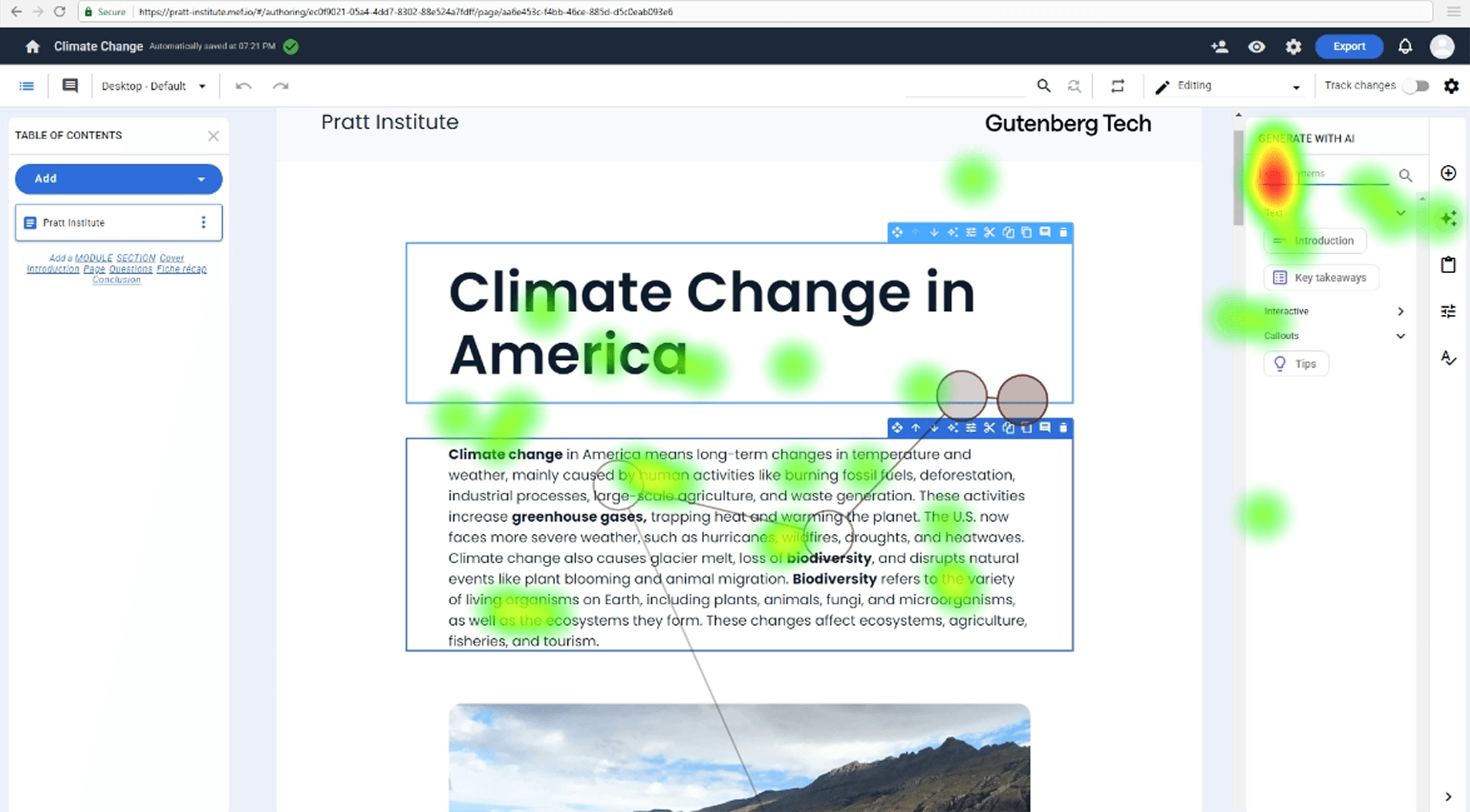
Participant 5 didn’t fixate on the icon at all when tasked to “Edit with AI.”
Participant 2 had high fixation on all of the icons across the side panel denoting the confusion she experienced while generating with AI.
“Since it was a task to create something new, I went to the add button.”
- Participant 2
Recommendation 1
Consolidate all editing and generating functions into a single, predictable menu aligned with users’ mental models of content creation.
Before

"Add" and "Generate with AI" were separated into 2 tabs, and there were 3 edit icon buttons on tool bar.
After
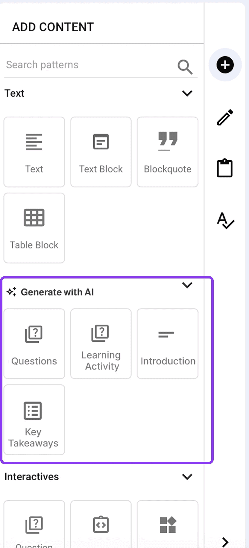

Consolidate all edit features into a button with a pencil icon, and move "Generate with AI" under the "Add" tab.
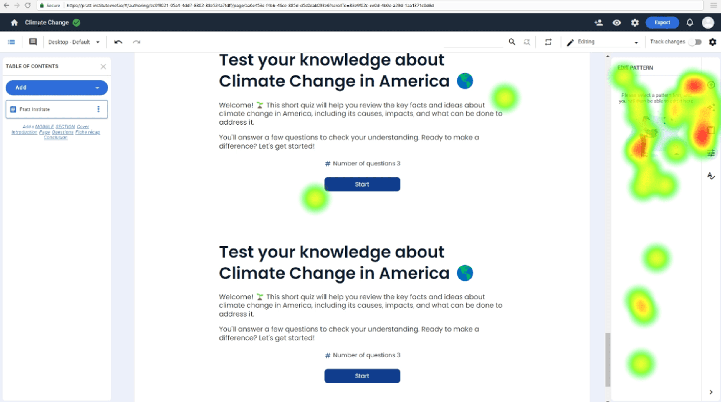
Difficulty Differentiating AI-Generated Content from Original Text
Finding 2
Due to a lack of visual clues, comparing the original and the newly generated content was hard.
Participants repeatedly expressed frustration when trying to identify what the AI changed. Many resorted to reading both versions line by line, which was slow and cognitively taxing.
Participant 8 was trying to read through all the content to identify differences.
“It is very mentally taxing to read through both things to try and see what’s changed.”
- Participant 7
“I had no idea where AI edited anything so I had to keep going back and forth”
- Participant 8
Recommendation 2
Consolidate all editing and generating functions into a single, predictable menu aligned with users’ mental models of content creation.
Before
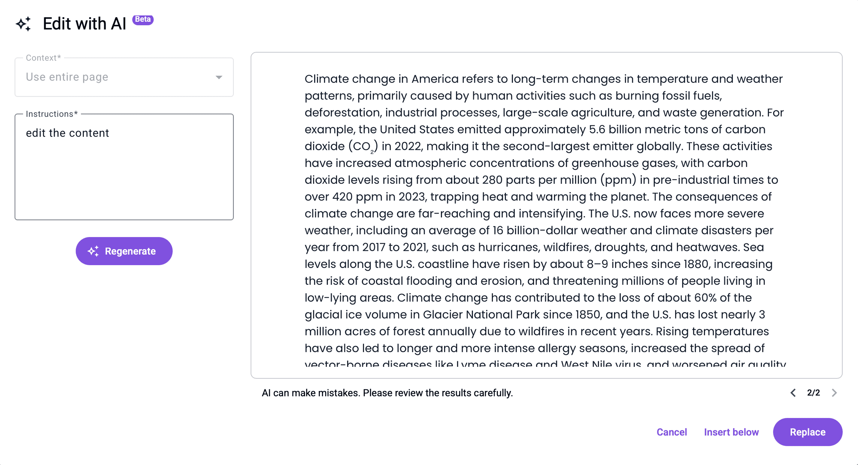
One frame in the modal displays a version and users need to click the version control button to switch between versions.
After
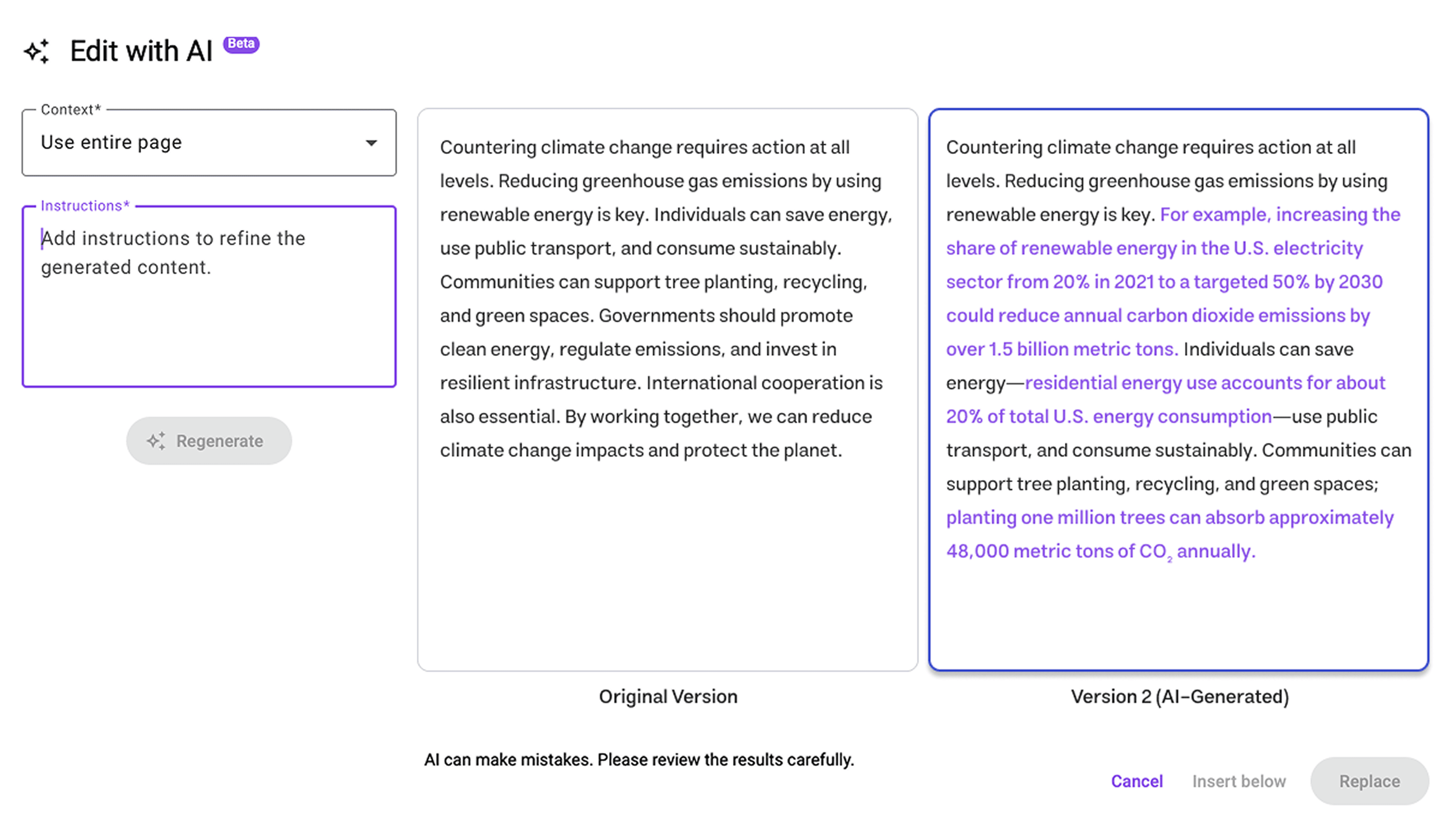
Two versions are displayed side by side for easier visual comparison. Eye-tracking data showed frequent switching between versions after reading the content. The side-by-side layout reduces cognitive load on comparison.
Unclear AI Terminology Confuses Users
Finding 3
While most participants successfully used the AI features, unclear AI terminology led to frustrations when completing tasks.
Users, even those familiar with AI concepts, were confused by the platform's specific jargon, leading to a lack of confidence in their selections.
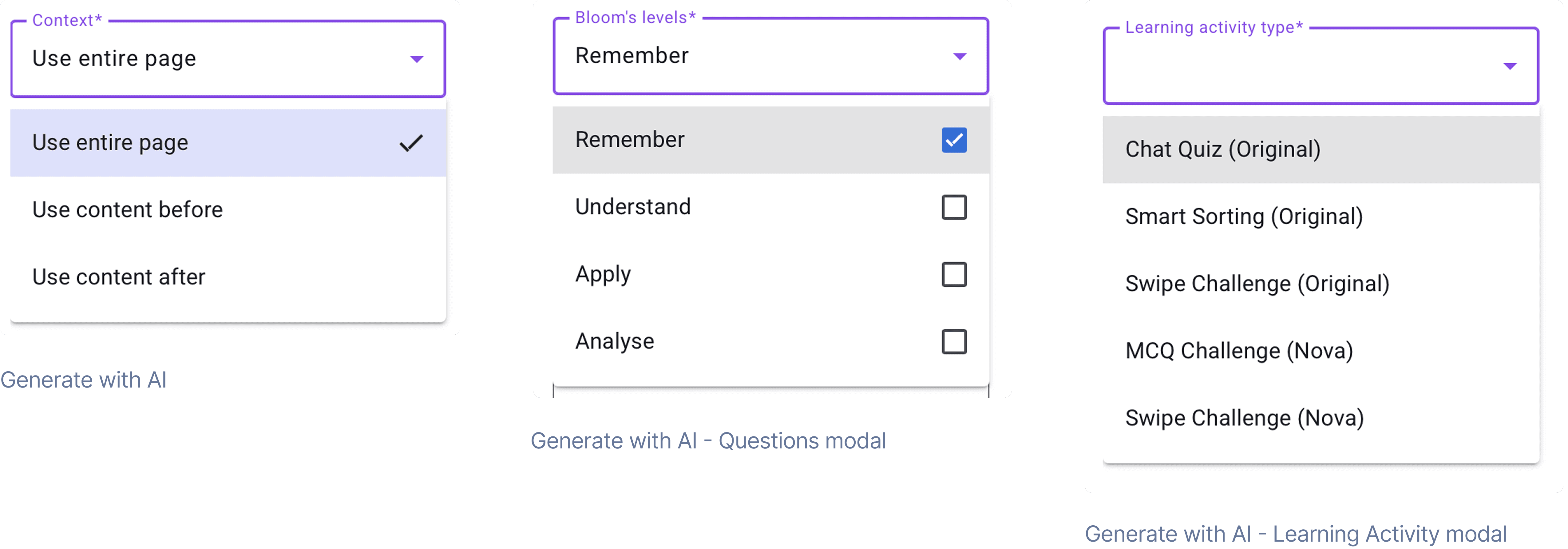
Participant 3 selected all options from Bloom’s levels
“I don't know what Bloom's levels mean, so I just selected all of them.”
- Participant 3
“I'm not familiar with some of the terminology of these products.”
- Participant 7
Recommendation 3
Consolidate all editing and generating functions into a single, predictable menu aligned with users’ mental models of content creation.
Before
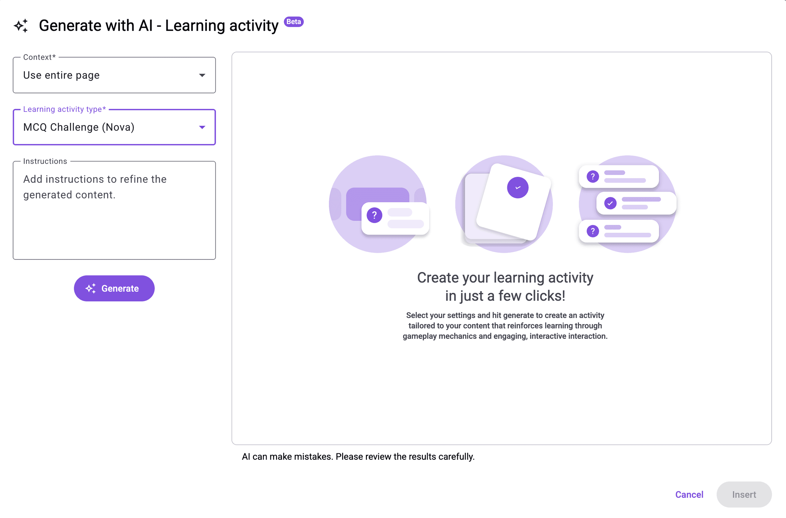
Participants lacked confidence when selecting options due to unclear activity definitions.
After
*Designed by me
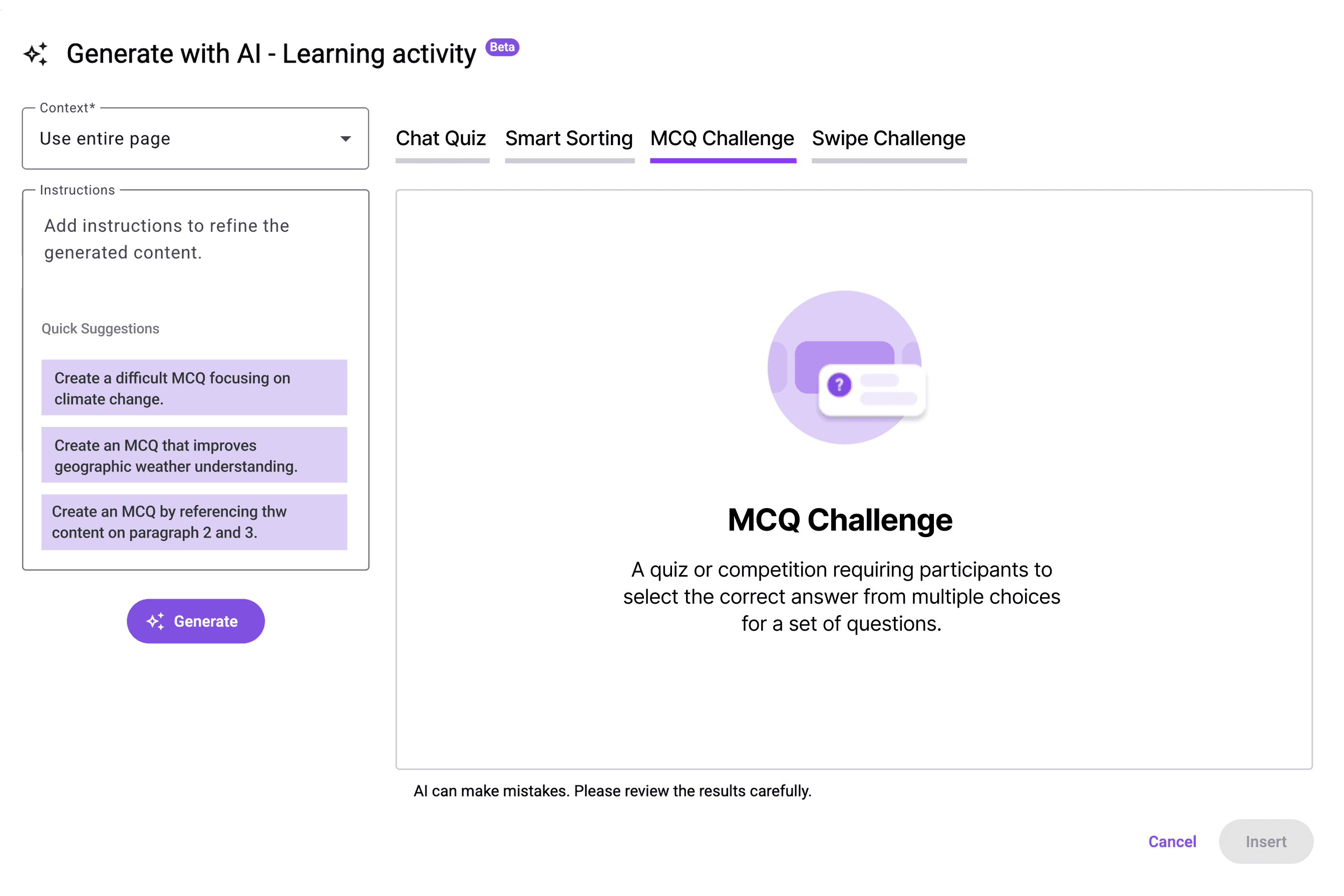
Adjusting the activity types from a dropdown menu to a tab-based interface allows GT to include a detailed description for each type, ensuring users have a clear comprehension before making a selection.
Feedback
We delivered our findings to the GT team alongside annotated recordings, synthesized insights, and redesigned interface concepts. The client responded positively—particularly to the proposed consolidation of tools and improvements to AI-related terminology. GT confirmed that many of these recommendations align with their 2026 roadmap for merging AI and non-AI patterns to streamline the authoring experience.


Next Steps
The next step is to validate the hypothesis that displaying the original and newly generated content side-by-side will decrease the time spent on the "Edit with AI" modal and reduce clicks on the version control button.
To achieve this, I will execute a structured A/B test comparing the Control (A) the existing click-to-switch version against the Variation (B)the new side-by-side design.
Control (A)
One frame in the modal displays a version and users need to click the version control button to switch between versions.
Variation (B)
Two versions are displayed side by side and changes are highlighted for easier visual comparison. The layout reduces cognitive load on comparison.
Key Action Plan
Step 1. Internal Development and Review: We will create the Variation (B) design using current components and test it internally.
Step 2. Metric Setup: We will set up Optimizely and Google Analytics to track the specific metrics: Primary: Time on page for the modal , and Secondary: Clicks on the version control button.
Step 3. Formal Testing: The A/B test will be conducted with 400 participants (200 for Control A / 200 for Variant B) who have experience writing or editing educational materials, ideally sourced from the United States and France.
Step 4. Analysis: We will analyze the data from both Optimizely and Google Analytics to validate the hypothesis and generate the final recommendation for the client.
Retrospective
Working with AI reminded me that design doesn’t always come with clear answers, especially when the product space is still evolving. I learned to navigate ambiguity by grounding decisions in user behavior rather than assumptions. When terminology was unclear or interactions didn’t match expectations, the solution wasn’t to find the “right” answer, but to explore possibilities until the patterns made sense. This project taught me to be comfortable with the unknown, to ask better questions, and to trust the process of uncovering clarity where none existed at the start.

