Oma | Financial Chat Bot
Oma | Financial Chat Bot
Spend More, or Ask Mom? Designing a Financial Bot with Tough Love in a Budgeting App
Spend More, or Ask Mom? Designing a Financial Bot with Tough Love in a Budgeting App
Budgeting apps are everywhere. So why are we still broke? Because they show you numbers, but they don't care. Meet Oma — a financial chatbot with opinions. She tracks your goals, calls out your impulse buys, and makes sure you actually stick to the plan — even when she's nagging you.
Budgeting apps are everywhere. So why are we still broke? Because they show you numbers, but they don't care. Meet Oma — a financial chatbot with opinions. She tracks your goals, calls out your impulse buys, and makes sure you actually stick to the plan — even when she's nagging you.
Conversational UX
Conversational UX
Chatbot
Chatbot
UI Design
Design Token
My Role
Conversational UX Design
Voice + Text Chatbot
Visual Identity
Project Management
Team
Conversation Designer
Engineer
Deliverables
Voice + Text Chat Bot
User Interface
Intent & Utterance & Script
Personality Design
Timeline
2026.04 - 2026.05
Contributions
I shaped this bot from concept to conversation
I shaped this bot from concept to conversation
💡 Concept & Proposal
Found that tone is the missing layer in fintech UX. So I pitched the "mom voice" financial accountability bot idea.
Found that tone is the missing layer in fintech UX. So I pitched the "mom voice" financial accountability bot idea.
✍️ Script Writing
Wrote the "Should I Buy This?" flow. Both the Yes path (earned approval) and the No path (firm redirection with alternatives).
Wrote the "Should I Buy This?" flow. Both the Yes path (earned approval) and the No path (firm redirection with alternatives).
🗺️ Flowchart
Designed the user flow for conversation architecture and decision logic, mapping the three entry points into the flow.
Designed the user flow for conversation architecture and decision logic, mapping the three entry points into the flow.
🤖 Vibe-coded Bot
Built the prototype with Claude & Figma Make by implementing intents, slots, and conditional branching for all core flows.
Built the prototype with Claude & Figma Make by implementing intents, slots, and conditional branching for all core flows.
01 The Introduction
01 The Introduction
The Conversation That Started It All
"Didn't you just buy a Stanley tumbler last month?"
"Didn't you just buy a Stanley tumbler last month?"
My friend almost bought a $38 water bottle she didn't need. I talked her out of it in four messages. That's when I thought — what if a chatbot could do that?
My friend almost bought a $38 water bottle she didn't need. I talked her out of it in four messages. That's when I thought — what if a chatbot could do that?
This is a real conversation between my friend and me, illustrating how young adults often need a second opinion to curb their impulse spending.
This is a real conversation between my friend and me, illustrating how young adults often need a second opinion to curb their impulse spending.
The Problem
We know we should save. We just don't 🤥
We know we should save. We just don't 🤥
Young adults with big financial goals, such as a trip, a degree, or an emergency fund, often fail not from lack of information but from lack of accountability. Budgeting apps give charts, but they don't give you a reaction when you make an unnecessary purchase.
Young adults with big financial goals, such as a trip, a degree, or an emergency fund, often fail not from lack of information but from lack of accountability. Budgeting apps give charts, but they don't give you a reaction when you make an unnecessary purchase.
Main Causes
The real issue isn't math. It's accountability
The real issue isn't math. It's accountability
😶
Data without emotion
Financial dashboards show the numbers, but can't respond to the decision in the moment.
Financial dashboards show the numbers, but can't respond to the decision in the moment.
🎯
Goals without structure
Users set savings goals and forget them. There's no recurring voice reminding them of the goal.
Users set savings goals and forget them. There's no recurring voice reminding them of the goal.
🛍️
Impulse without pushback
At the moment of purchase, no tool asks: " Is this a need, a want, or just a really bad week talking?"
At the moment of purchase, no tool asks: " Is this a need, a want, or just a really bad week talking?"
🤷
No one to disappoint
Self-accountability is hard. The most effective check isn't an algorithm; it's a person who cares.
Self-accountability is hard. The most effective check isn't an algorithm; it's a person who cares.
HMW
How might we intervene in moments of impulse spending with guidance that feels supportive, human, and hard to ignore?
HMW
How might we intervene in moments of impulse spending with guidance that feels supportive, human, and hard to ignore?
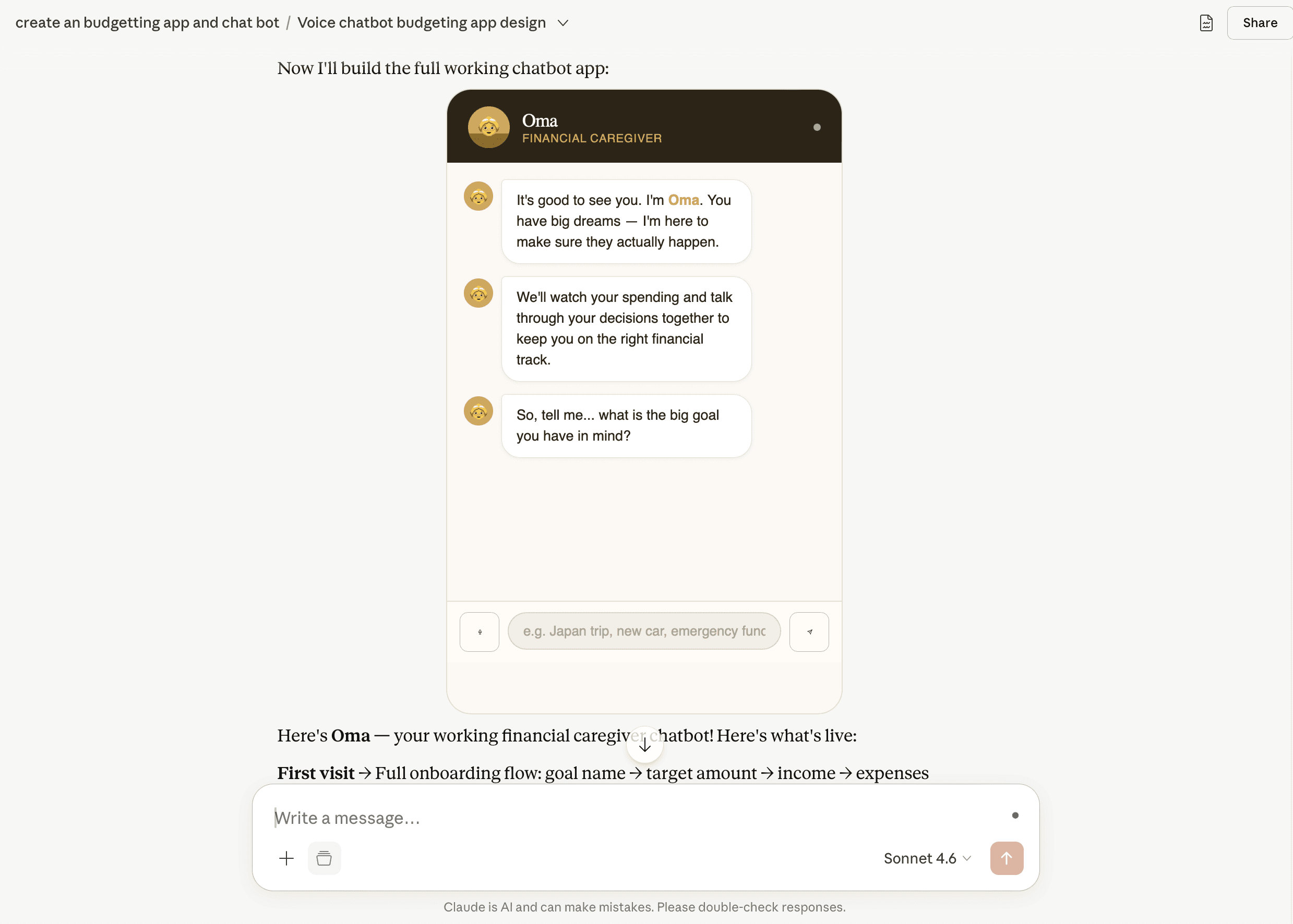
Meet the Bot
Introducing Oma — She's warm, she's firm, and she remembers every single thing about your goal
Introducing Oma — She's warm, she's firm, and she remembers every single thing about your goal
The bot is designed around one archetype: the mom who loves you enough to tell you the truth. She celebrates real wins, gives practical alternatives, and holds her position when you try to argue. Her tone isn't punishment — it's investment.
The bot is designed around one archetype: the mom who loves you enough to tell you the truth. She celebrates real wins, gives practical alternatives, and holds her position when you try to argue. Her tone isn't punishment — it's investment.

Personality traits
Warm → Firm → Proud → Disappointed. Never cruel. Always invested. The scale shifts based on urgency and user behavior.
Warm → Firm → Proud → Disappointed. Never cruel. Always invested. The scale shifts based on urgency and user behavior.
Core features
Goal setup · Expense logging · Pre-purchase decision check · Progress check-in · Escalating nag mode
Goal setup · Expense logging · Pre-purchase decision check · Progress check-in · Escalating nag mode
02 The Design Decisions
02 The Design Decisions
The Personality
Why "mom" and not a financial advisor?
Why "mom" and not a financial advisor?
An advisor is authoritative but cold. A mom is authoritative and emotionally invested. The archetype carries warmth that makes the pushback feel supportive rather than punitive — you can argue with a bot, but you can't really argue with your mom.
An advisor is authoritative but cold. A mom is authoritative and emotionally invested. The archetype carries warmth that makes the pushback feel supportive rather than punitive — you can argue with a bot, but you can't really argue with your mom.
✅ 👵 ❌ 👩💼
✅ 👵 ❌ 👩💼
The Name
Why did we name the bot "Oma"?
Why did we name the bot "Oma"?
Oma means grandma in German, mom in Korean (Umma), and mother in many South Asian languages (Amma). Across cultures, it's the person who worries about you and tells you the truth whether you ask or not. That's exactly who this bot is.
Oma means grandma in German, mom in Korean (Umma), and mother in many South Asian languages (Amma). Across cultures, it's the person who worries about you and tells you the truth whether you ask or not. That's exactly who this bot is.
= 🇩🇪 👵 ≈🇰🇷 🇹🇼 🧓
= 🇩🇪👵 ≈🇰🇷🇹🇼🧓
Modality
Voice when you need to feel it. Text when you don't want anyone to hear it
Voice when you need to feel it. Text when you don't want anyone to hear it
Oma supports both voice and text and the choice is intentional. Voice makes her feel more like a real person. Hearing "didn't you just buy one last month?" hits differently than reading it. But money is personal. In public, on the subway, at work, sometimes you just need to type it out quietly. Both modes, same Oma.
Oma supports both voice and text and the choice is intentional. Voice makes her feel more like a real person. Hearing "didn't you just buy one last month?" hits differently than reading it. But money is personal. In public, on the subway, at work, sometimes you just need to type it out quietly. Both modes, same Oma.
🔈for feeling & 💬 for Privacy
🔈for feeling
💬 for Privacy
🔈for feeling
& 💬 for Privacy
Features with Conversational Fit
What features are suitable for conversation, and why?
What features are suitable for conversation, and why?
Spending decisions are emotional and happen in the moment. A chart can't respond to that. We used Google's conversation design framework to validate each feature before building it.
Spending decisions are emotional and happen in the moment. A chart can't respond to that. We used Google's conversation design framework to validate each feature before building it.
🛍️
Ask Before You Buy
People already ask others before making a purchase. The decision is brief, personal, and happens on the go. A form can't say, "Didn't you just buy one last month?"
💸
Log an Expense
Faster than navigating to a form. One message, one category, done. Conversation reduces the friction that makes people stop logging altogether.
📊
Check My Progress
Financial check-ins are inherently conversational. It's how you'd talk to a financial advisor, a parent, or a friend. Numbers alone don't motivate. A reaction does.
🛍️
Ask Before You Buy
People already text friends before making a purchase. The decision is brief, personal, and happens on the go. A form can't say, "Didn't you just buy one last month?"
💸
Log an Expense
Faster than navigating to a form. One message, one category, done. Conversation reduces the friction that makes people stop logging altogether.
📊
Check My Progress
Financial check-ins are inherently conversational — it's how you'd talk to a financial advisor, a parent, or a friend. Numbers alone don't motivate. A reaction does.
User Flow
Every conversation starts with a goal. Everything else keeps you on track
Every conversation starts with a goal. Everything else keeps you on track
Oma gets to know you once, then shows up every time to help you get closer to the goal. The flow is designed around how people actually think about money, not by category, but by moment.
Oma gets to know you once, then shows up every time to help you get closer to the goal. The flow is designed around how people actually think about money, not by category, but by moment.
1
Set Up the Goal
2
Log an Expense
3
Ask Before Buying
4
Check the Progress
1
Set Up the Goal
2
Log an Expense
3
Ask Before Buying
4
Check the Progress
The Challenge
The bot that almost lived in the wrong place
The bot that almost lived in the wrong place
⚠️ Amazon Lex isn't customizable
⚠️ Amazon Lex isn't customizable
We started with Amazon Lex. It handled the basics, but it was hard to be creative. Customization had a ceiling, and Oma needed more room than that.
We started with Amazon Lex. It handled the basics, but it was hard to be creative. Customization had a ceiling, and Oma needed more room than that.
💡 I vibe-coded the bot with Claude, then refined it in Figma Make until it looked like Oma
💡 I vibe-coded the bot with Claude, then refined it in Figma Make until it looked like Oma
The first version in Claude was rough. I kept iterating on the visual, interaction, and user flow in Figma Make until it finally looked like someone Oma's personality deserved.
The first version in Claude was rough. I kept iterating on the visual, interaction, and user flow in Figma Make until it finally looked like someone Oma's personality deserved.


03 The Design
03 The Design
Script
Every word is a design choice. Here's why we wrote it that way
Every word is a design choice. Here's why we wrote it that way
Oma isn't just a bot with a script. She has principles. Each response is written around one of six communication strategies, so no matter what you're buying or how you're feeling, she always sounds like herself.
Oma isn't just a bot with a script. She has principles. Each response is written around one of six communication strategies, so no matter what you're buying or how you're feeling, she always sounds like herself.
Future-First Thinking
"Future You" will thank me, even if "Current You" is annoyed.
Strategic Guilt
Just keep an eye on the small things. They add up faster than you think!
Practical Over Emotional
Stress doesn’t make the price tag any smaller.
Calm Disapproval
You can do better than this.
Meaningful Approval
Good decision. That’s the kind of focus I like to see.
Financial Wisdom Framing
Money is freedom. Don’t trade it too easily.
Voices of Oma
Not every mom sounds the same, so I proposed the voice and language options
Not every mom sounds the same, so I proposed the voice and language options
During testing, I noticed people had different opinions about how Oma should talk. Some wanted warmth, some wanted tough love, some just wanted the facts. So I proposed giving users the flexibility to choose their own version of Oma in their preferred languages: same values, different delivery.
During testing, I noticed people had different opinions about how Oma should talk. Some wanted warmth, some wanted tough love, some just wanted the facts. So I proposed giving users the flexibility to choose their own version of Oma in their preferred languages: same values, different delivery.
Warm
Calm and nurturing
👩🦱
0:00/1:34
Neutral
Clear and grounded
🧓
0:00/1:34
Strict
Direct and firm
👩💼
0:00/1:34
Chatbot
Setting up our happy path
Setting up our happy path
Onboarding:
Setting a Goal
Onboarding:
Setting a Goal
Ask for a financial goal, and it’s timeline
Budget required
Income and monthly expenses
Set your monthly goal
Ask for a financial goal, and it’s timeline
Budget required
Income and monthly expenses
Set your monthly goal
Feature 1: Guided Purchase Decisions (Designed by me)
Feature 1: Guided Purchase Decisions (Designed by me)
Ask before you buy
Select “I’m about to buy something..should I”
The purchase you want to make, along with urgency
Ask before you buy
Select “I’m about to buy something..should I”
The purchase you want to make, along with urgency
The "No" Path (Play it 🔉!)
The "No" Path (Play it 🔉!)
The "Yes" Path
The "Yes" Path
Feature 2:
Log Expenses with Goal-Based Feedback
Feature 2:
Log Expenses with Goal-Based Feedback
Select “log something I spent.”
Enter what you purchased
Categorization of expenses by date
Reminder of the goal
Select “log something I spent.”
Enter what you purchased
Categorization of expenses by date
Reminder of the goal
Feature 3:
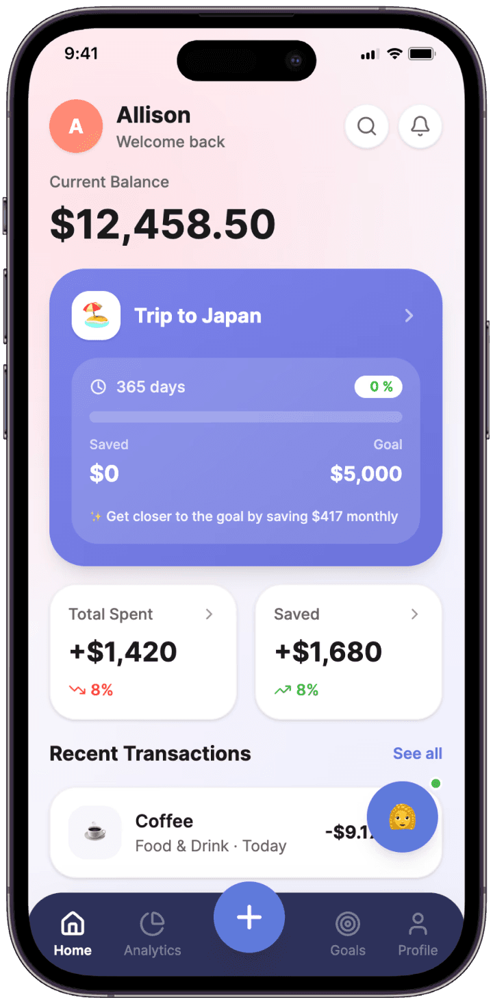
Progress Check-ins with Feedback
Feature 3:
Progress Check-ins with Feedback
Overall progress can be reflected along with monthly goal and total aim towards the set financial goal
Overall progress can be reflected along with monthly goal and total aim towards the set financial goal
04 The Result
04 The Result
Feedback & Next Step
"This sounds exactly like my wife."
"This sounds exactly like my wife."
The responses confirmed Oma's personality landed. One tester said it would genuinely help them avoid impulse spending. Another pushed harder: what happens when the user just keeps saying they want to buy something anyway? One suggestion came up that stuck: just lock the card. It's extreme, but it opened up a real conversation about how far accountability should go. That might be Oma's next move.
Want to learn more about Oma? Here is our Slide Deck.
Want to learn more about Oma? Here is our Slide Deck.
Takeaways
I came for the chatbot. I stayed for the vibe coding.
I came for the chatbot. I stayed for the vibe coding.
This project taught me how to vibe code a working product and write precise prompts. Vague instructions give you a generic bot. Specific ones give you Oma. Working with intents, slots, and scripts also changed how I think about UX. In visual design, you control what users see. In conversational design, you control what they hear, when they hear it, and how it makes them feel. That's a completely different muscle.
Conversational UX is where things are going. The more I understand how to design for conversation, the more I realize knowing how to structure a script is becoming as fundamental as knowing how to structure a screen.