Rebranding of Pratt Industrial Design Program
Rebranding of Pratt Industrial Design Program
Led a full visual identity refresh for Pratt's Industrial Design program by rebuilding the style guide and everyday touchpoints into one cohesive, recognizable brand.
Led a full visual identity refresh for Pratt's Industrial Design program by rebuilding the style guide and everyday touchpoints into one cohesive, recognizable brand.
01 Style Guide
01 Style Guide
Rooted in Pratt, distinct as IND
Rooted in Pratt, distinct as IND
Pulled from Pratt's existing color accents, with blue as IND's primary and Pratt Yellow as the accent, connected to the school's identity, but immediately recognizable as its own department.
Pulled from Pratt's existing color accents, with blue as IND's primary and Pratt Yellow as the accent, connected to the school's identity, but immediately recognizable as its own department.



Aa
Aa
Produkt
Produkt
Aa
Aa
Graphik
Graphik
Aa
Aa
Tiempos
Tiempos
Pratt Yellow
Pratt Yellow
#FFCE2E
Black
Black
#000000
Pratt Cool Gray
Pratt Cool Gray
#FFCE2E
White
White
#FFCE2E
Pratt Blue
Pratt Blue
#FFCE2E
A minimal system with just enough depth
A minimal system with just enough depth
Basic geometric forms with subtle gradients bring a touch of dimensionality. A nod to Industrial Design's hands-on, three-dimensional craft, without cluttering the system.
Basic geometric forms with subtle gradients bring a touch of dimensionality. A nod to Industrial Design's hands-on, three-dimensional craft, without cluttering the system.


02 Process
02 Process
Three directions, one clear winner
Three directions, one clear winner
Explored three concept directions rooted in the same brand logic. Each pushed the color, geometry, and gradient system in ways that felt like real alternatives, not just variations on a theme.
Explored three concept directions rooted in the same brand logic. Each pushed the color, geometry, and gradient system in ways that felt like real alternatives, not just variations on a theme.
Version 1

Version 2

Version 3 🏆
Presented all three to the department chair, who selected Version 3 for striking the right balance: clean and minimal, with just enough dimensionality to feel distinctly IND.
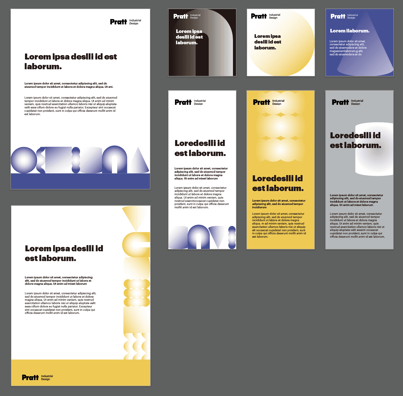
03 Application
03 Application


04 Weekly Newsletter
04 Weekly Newsletter
A redesign that moved the needle
A redesign that moved the needle
Built the department's weekly newsletter template with a cleaner hierarchy and on-brand visuals. Translated unstructured content into an easy-to-read format with CTAs, resulting in a higher open and click-through rate.
Built the department's weekly newsletter template with a cleaner hierarchy and on-brand visuals. Translated unstructured content into an easy-to-read format with CTAs, resulting in a higher open and click-through rate.
Before

After